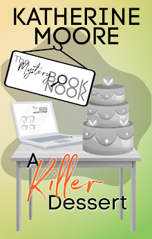
The cover to the left is the one in the ad, and it caught my eye because it looks like an old school Tanith Lee cover. (I still miss Tanith Lee!) It snagged my attention and then I read the blurb and clicked over to Amazon to claim my free book. Because ... free! But also because I've read some of X's other books, including The Siren. I like her books. They always have high stakes (like the survival of the human race.) And they don't have cookie cutter characters. So, very much looking forward to reading this book. But when I clicked over, the cover below was the one on offer. And I tell you right now, if I'd seen that shirtless angel photoshop cover, my eyes would have glided right past it.

I know there's been a lot of talk about "shirtless covers" and I've mostly kept out of it, but here's a real A/B test. To me, the book with the woman on the cover looks more interesting than the book with the shirtless angel. I'm not a prude, not at all. But the book above tells me the book is about a woman who is DOING SOMETHING. The shirtless angel cover tells me that the most important thing is the relationship with the shirtless angel. (Yes, I know it's a fantasy romance, but work with me here.)
Maybe if the guy's wings hadn't been off-center. (Because of the way his torso is turned, the wing on his left shoulder should have been turned as well and it isn't. The model has just been superimposed on the wings and it doesn't look great. In fact, it looks like a bazillion other covers you see in the Kindle book section.
I'm still looking forward to reading the book (which is #1 in one of his categories in the Free Book section right now), but I really wish the author had stuck with the original cover.


No comments:
Post a Comment