Derek Murphy is a book designer with a PhD in literature. I ran across this excellent blogpost he did (* Cover Design Secrets publishers use to manipulate readers into buying their books) If you're an indie author who creates your own covers, or someone who buys a lot of premades, like I do, the article is definitely worth the read.
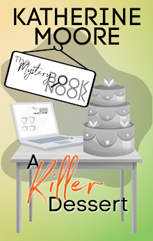
In one instance, he points out that an author's name looks a little "crowded" on the cover. That's a problem I run into when I use my real name. On premade covers, designers often use the placeholder text: Book Title and Author Name. As it happens, "Author Name" has the same number of letters as my pseudonym, "Kat Parrish," so I usually have a pretty good idea of how it's going to look on the cover. "Katherine Tomlinson," though, is a long name, taking up 19 spaces with the space between my first and last names. It's annoying to fall in love with a design and know that your name is just not going to look good all spelled out.
Actual book titles can also be a problem. BOOK has four letters, TITLE has five, and rarely will you have a book title that fits into just nine letters (ten if you count the space).
Sometimes designers will give a cover a placeholder title and I like it so well, I just tell them to put in the author name. (I did that with Love Note (see sidebar) because it worked very well for the story I was telling, a noir-ish little thriller. For the cover of Deus ex Magical, I had to get creative because there was not room for longer words in those horizontal pink bars. I spent a while playing with combinations of words to make it work.
I'll be coming back to Murphy's site often because he's got a lot of tidbits that will make my life (or any writer's life) easier. Check him out here. Just reading his "manifesto" will empower you.
Tuesday, January 3, 2017
Subscribe to:
Post Comments (Atom)


No comments:
Post a Comment