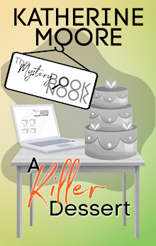
Derek Murphy is a book designer with a PhD in literature. I ran across this excellent blogpost he did (* Cover Design Secrets publishers use to manipulate readers into buying their books) If you're an indie author who creates your own covers, or someone who buys a lot of premades, like I do, the article is definitely worth the read.
In one instance, he points out that an author's name looks a little "crowded" on the cover. That's a problem I run into when I use my real name. On premade covers, designers often use the placeholder text: Book Title and Author Name. As it happens, "Author Name" has the same number of letters as my pseudonym, "Kat Parrish," so I usually have a pretty good idea of how it's going to look on the cover. "Katherine Tomlinson," though, is a long name, taking up 19 spaces with the space between my first and last names. It's annoying to fall in love with a design and know that your name is just not going to look good all spelled out.
Showing posts with label Derek Murphy. Show all posts
Showing posts with label Derek Murphy. Show all posts
Tuesday, January 3, 2017
Subscribe to:
Posts (Atom)


