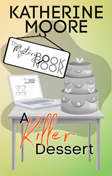
 Everyone agrees that readers DO judge a book by its cover, but what makes for a great cover? I like clean lines and great fonts. I spend a lot of time on Pinterest, and many people have "book covers" boards, which are great sources of inspiration if you are creating your own covers for books. The two most striking covers I can think of are the covers for Twilight and Memoirs of a Geisha. Both were incredibly simple and both were memorable. the thing is, the stunning Memoirs of a Geisha cover wasn't the first cover used. the original cover was the one seen to the left. It's elegant and beautiful but it isn't sexy, not in the way the updated cover was.
 The book sold a lot of copies and was adapted into a movie, but it would be really interesting to know how many copies of the book sold with the old cover versus the new. Look at the covers together. Which one would you rather read?


